Lumin Cyber Exposure
Challenge
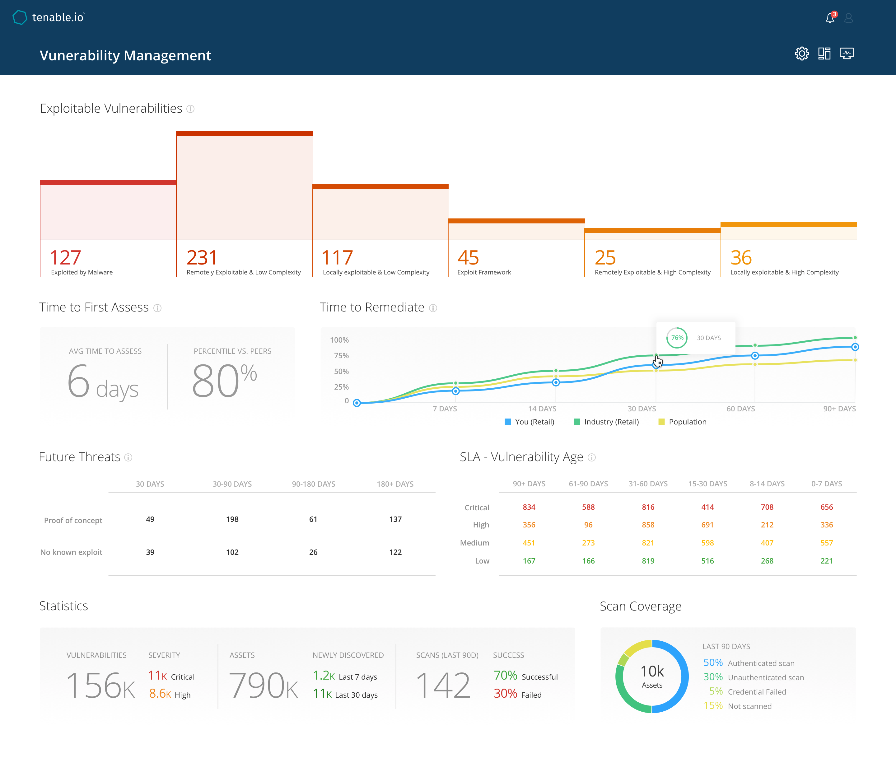
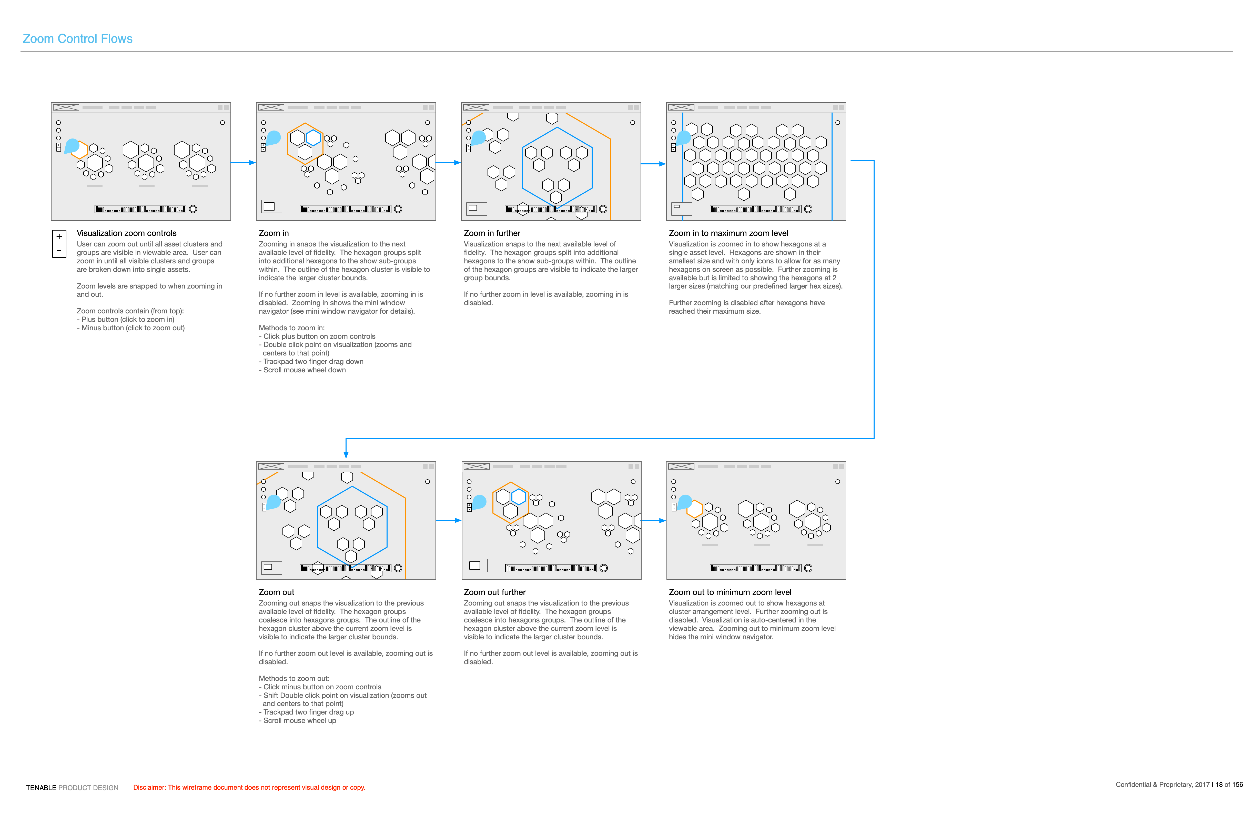
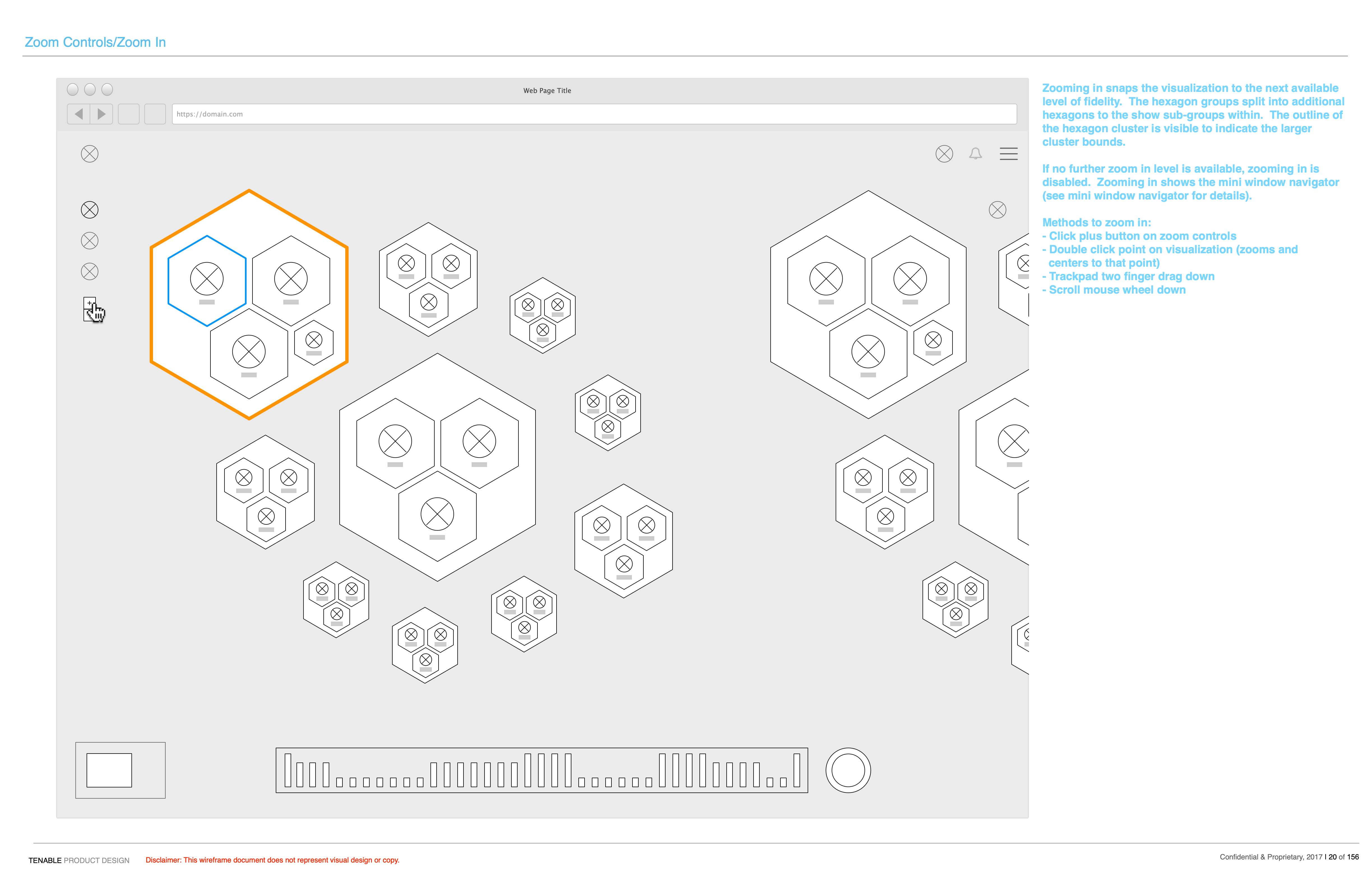
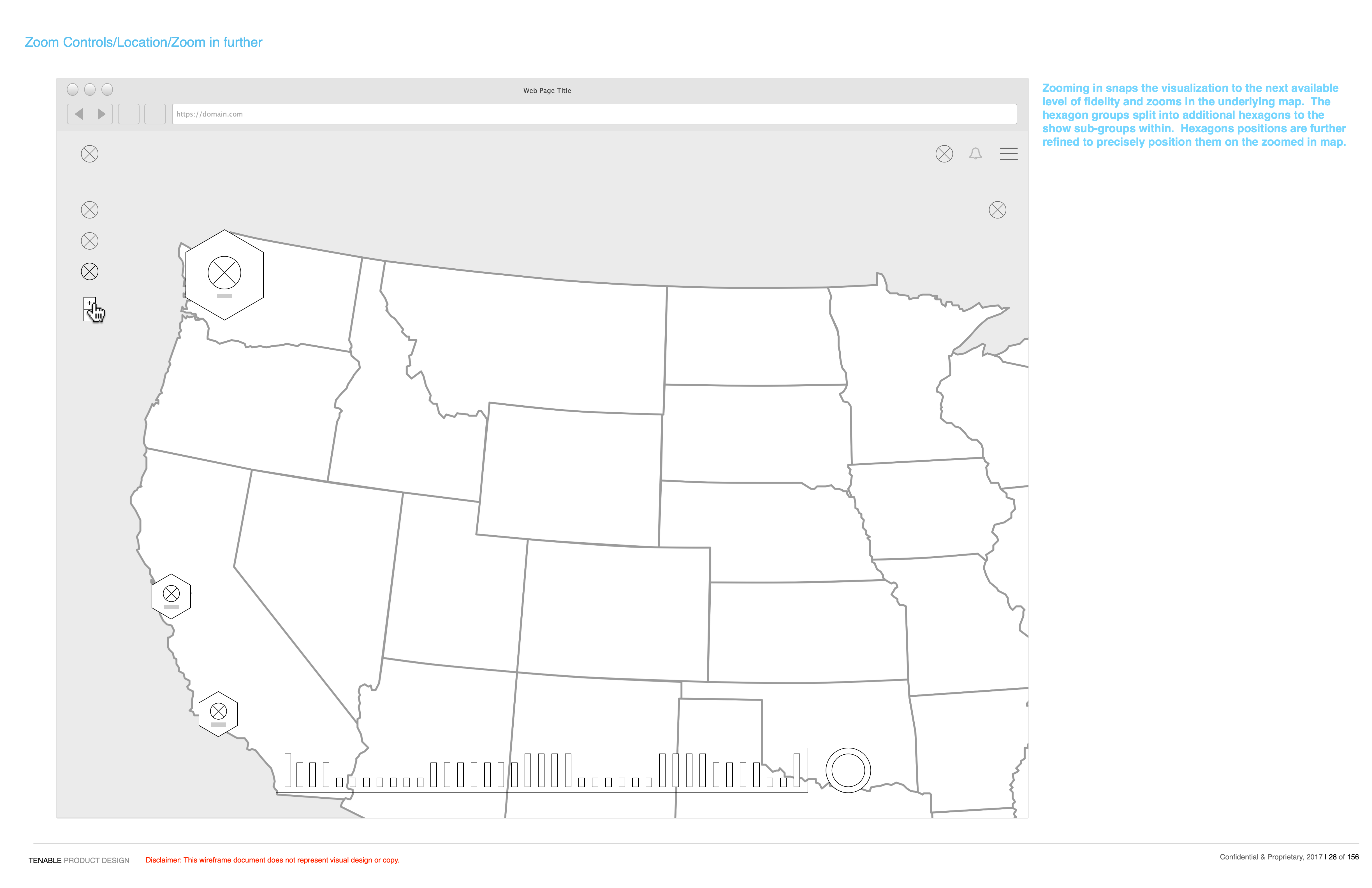
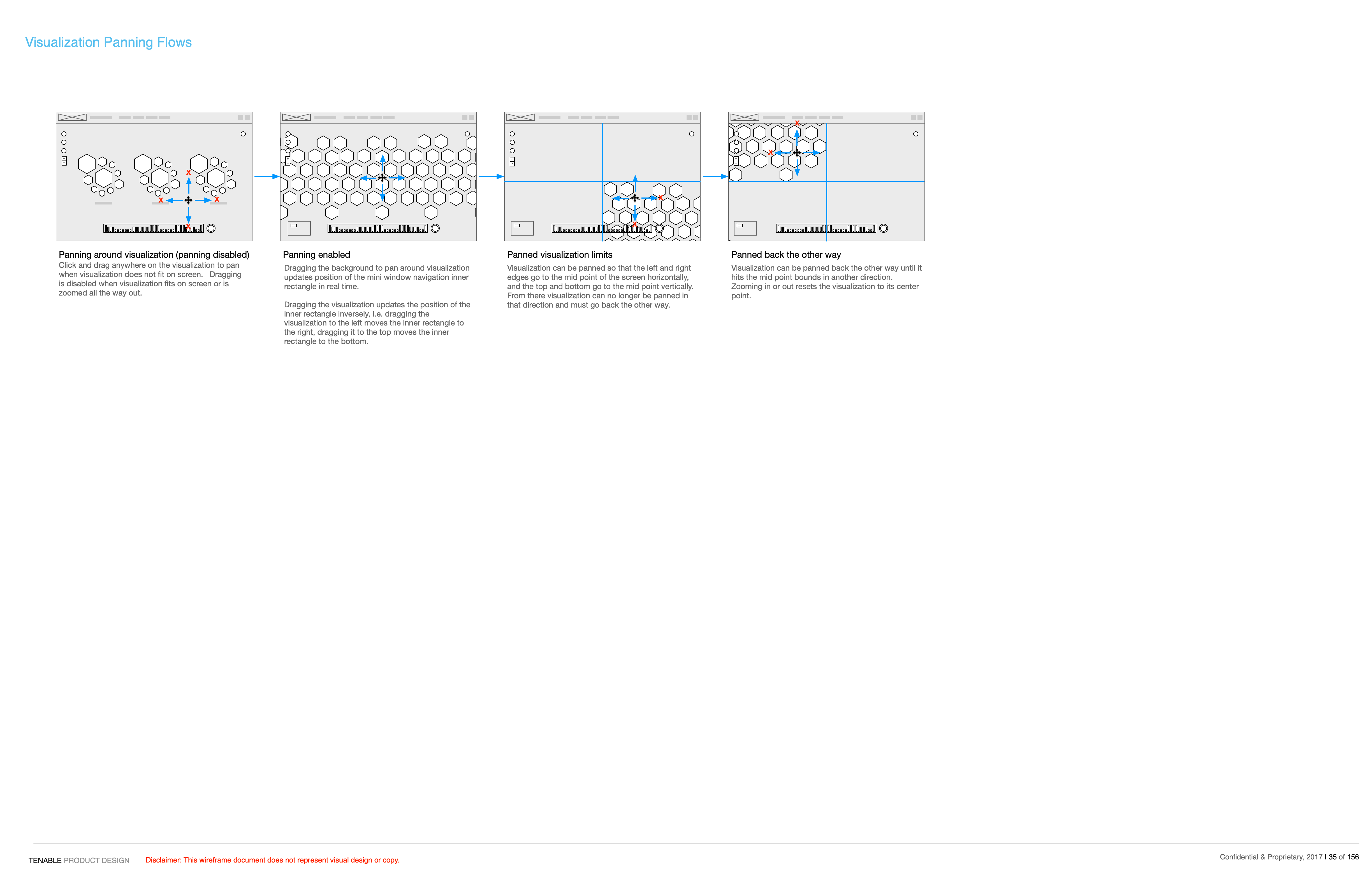
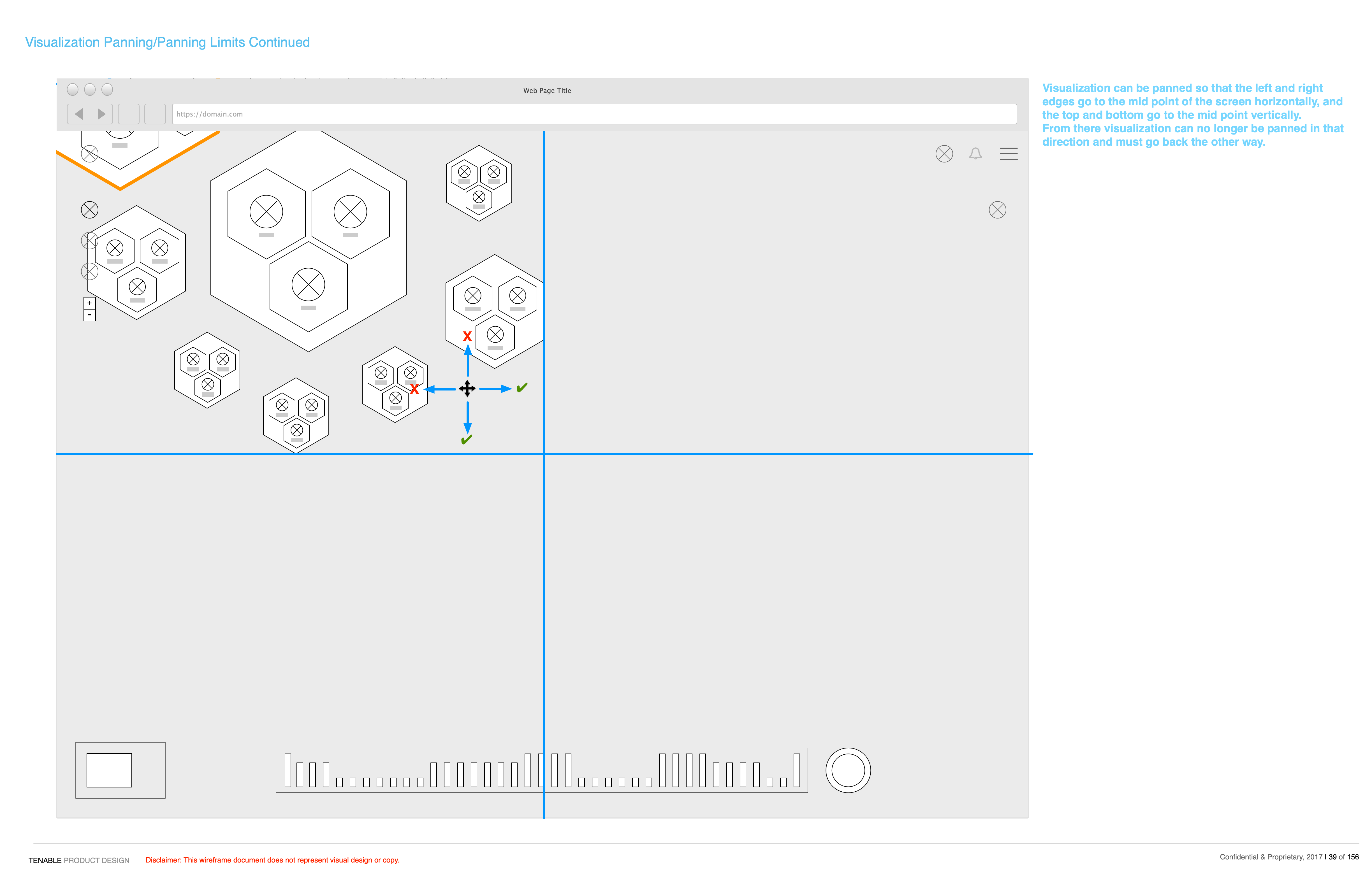
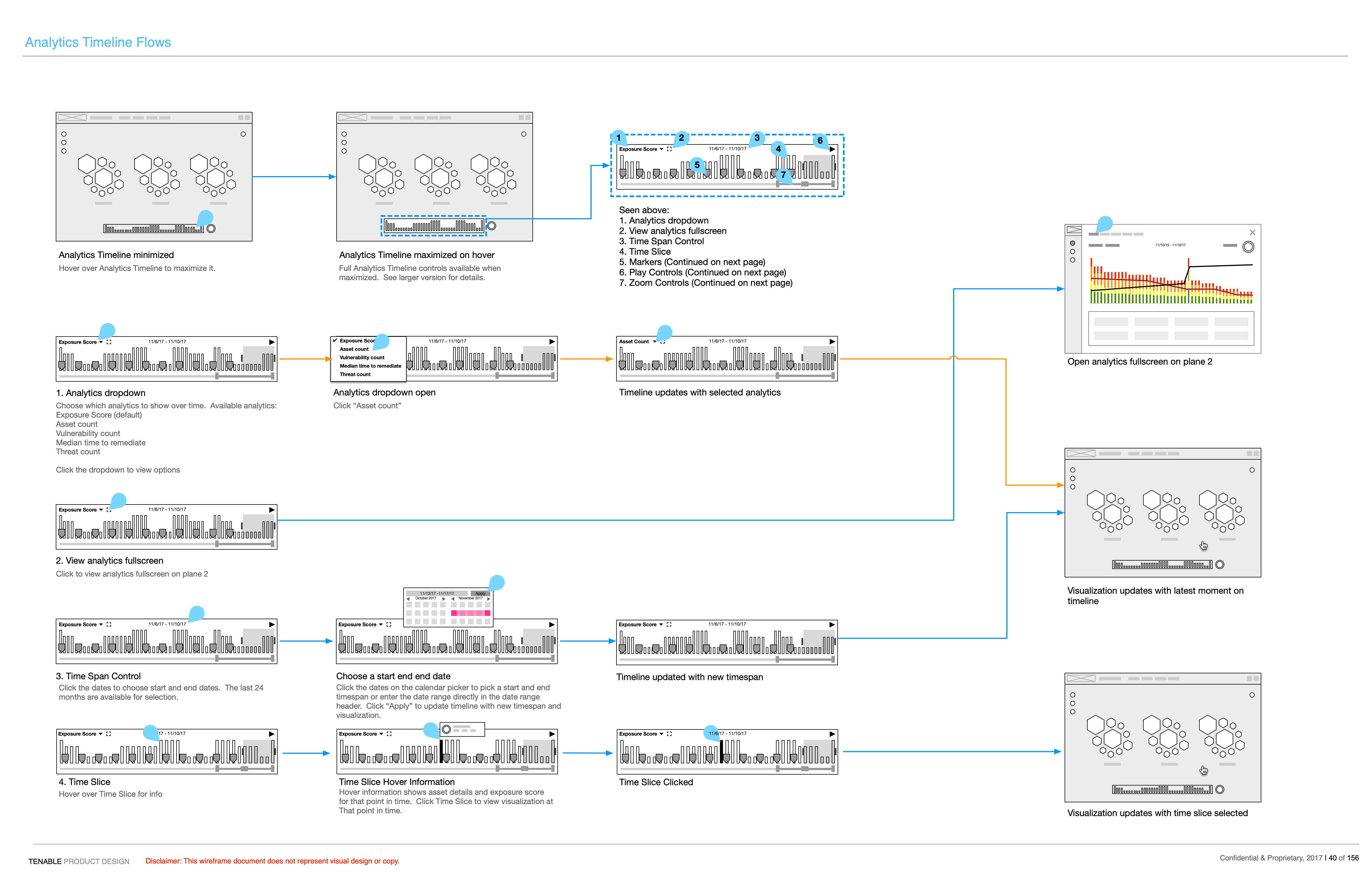
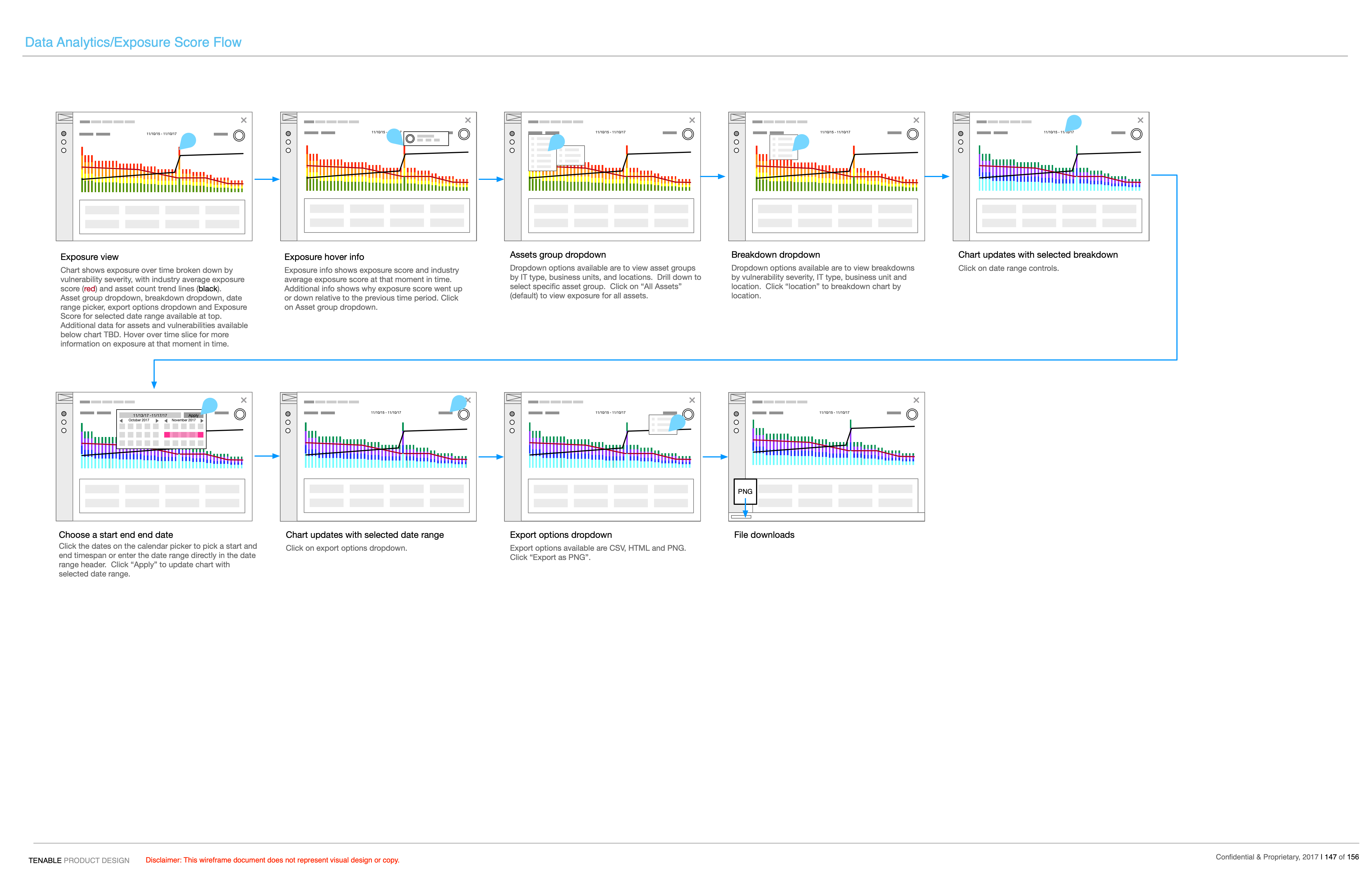
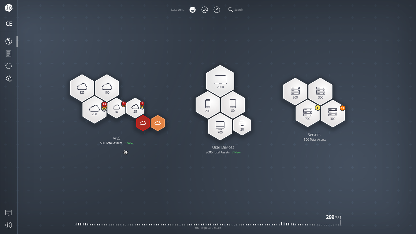
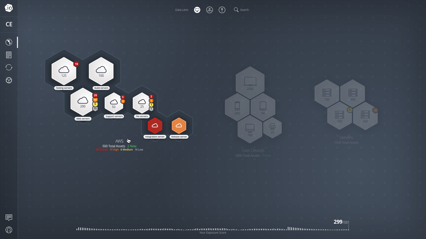
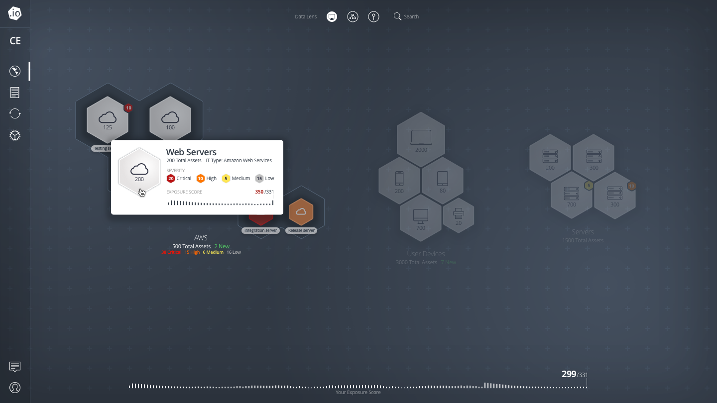
Tenable was in a unique position of providing an extreme amount of data about cyber security vulnerabilities within a customer's network, but much of it was hidden behind esoteric tables and filters. As such, our current vulnerability management product was only suited to a highly technical and engaged customer. Product and design set out to provide a ten thousand foot view of your cyber exposure, visualizing it so that our customers could hone in on the areas that needed the most investment of time and resources.
Process
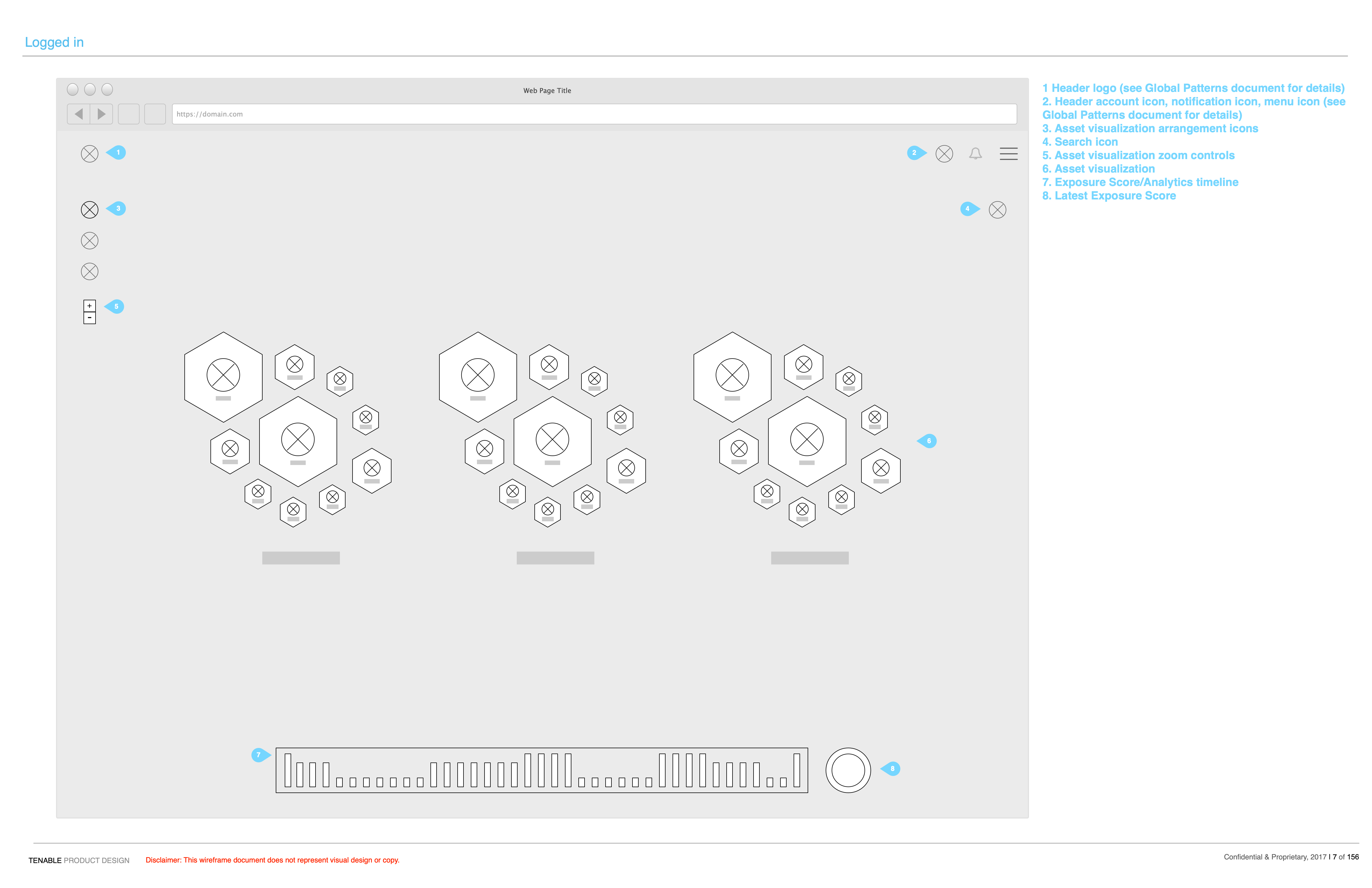
We identified additional personas that should be served by this new visualization product. Network security managers and CISOs (Chief Information Security Officer) were a particular target for this product, though the engineers remediating vulnerabilities would be able to utilize it as well to target their time. A wireframe document was put together to provide a vision for how this visualization would generally look, work and improve on the tedious task of identifying and remediating network vulnerabilities.
Solution
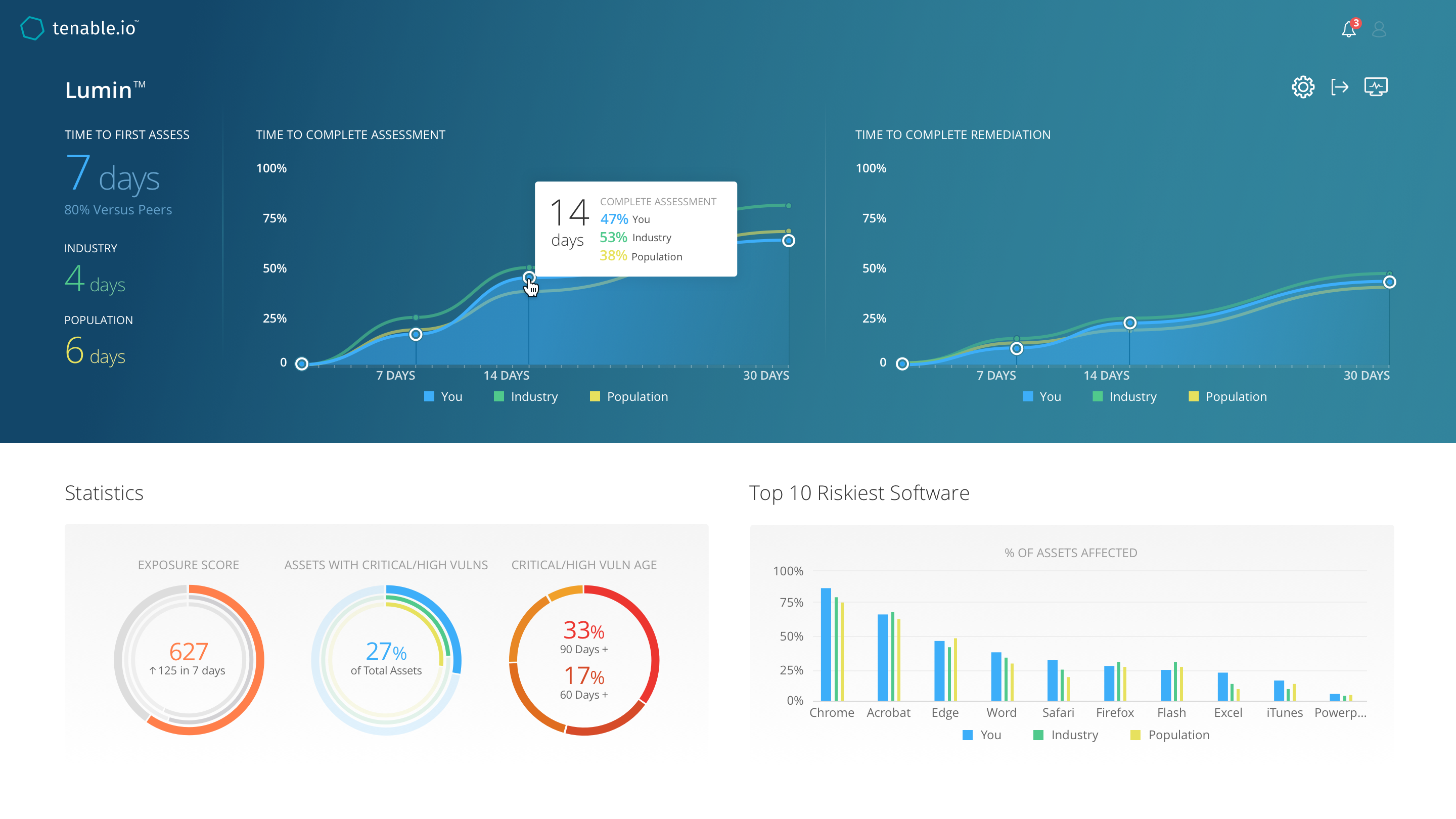
After many months of collaborating with product on wireframes our vision was complete, but after review with engineering, data science and leadership, it was determined that we should start smaller. While the fully navigable asset map we envisioned was our goal, engineering and data science would have months/years of work to be able to enable this. We scaled down the effort into a series of dashboards that could visualize the data we were able to generate from the new advanced data we were generating. The result was is a layer of information on top of the customer's existing vulnerability data, showing them how they are doing over time in remediating vulnerabilities and allowing them to focus on the highest priority issues.