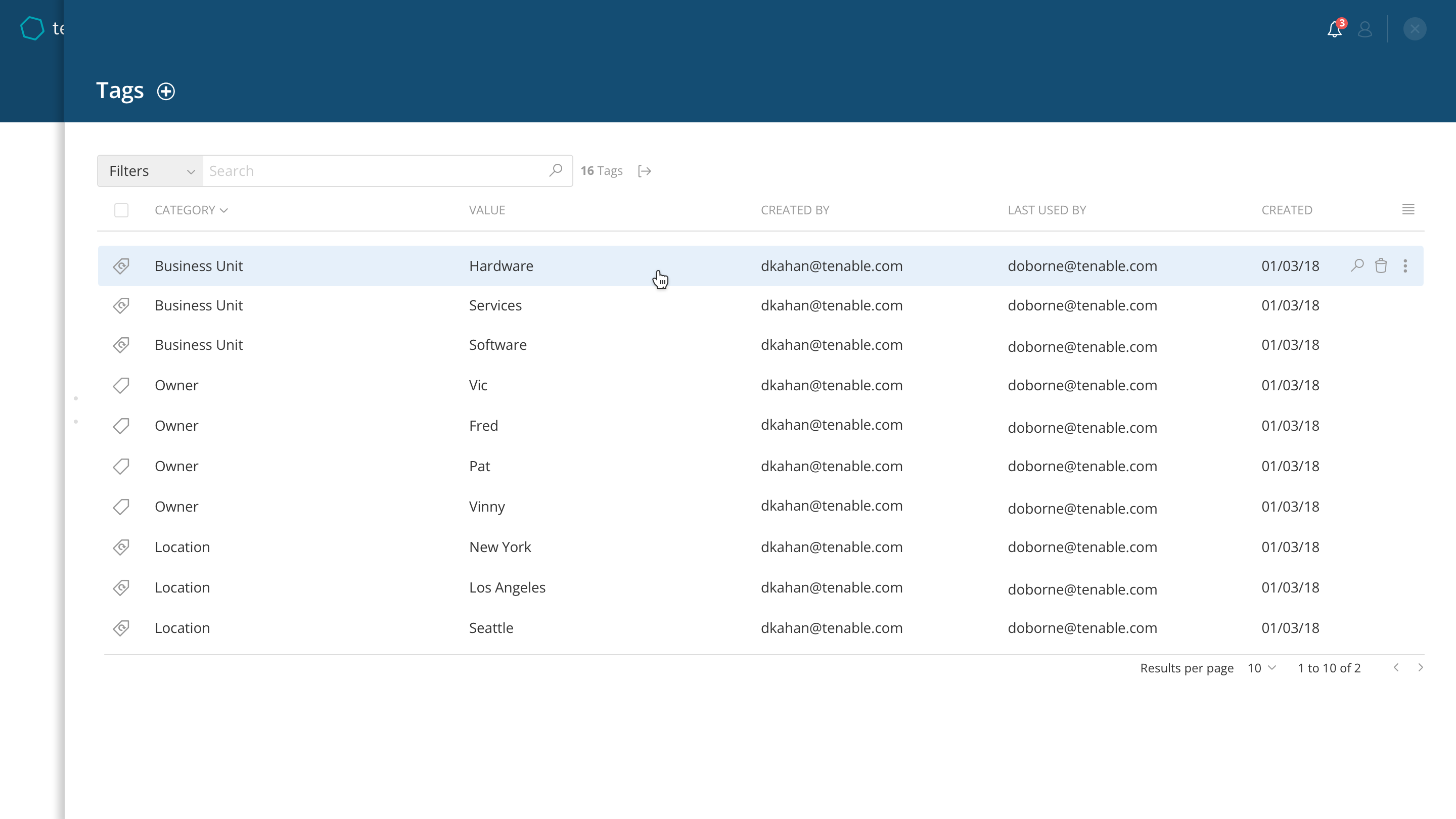
Cyber Asset Tag Management
Challenge
Managing network vulnerabilities across many hundred or thousands of machines is a complex job. With that kind of scale, it becomes important to be able to organize them into groups relevant to your organization, so that you can find, monitor and remediate security issues.
Process
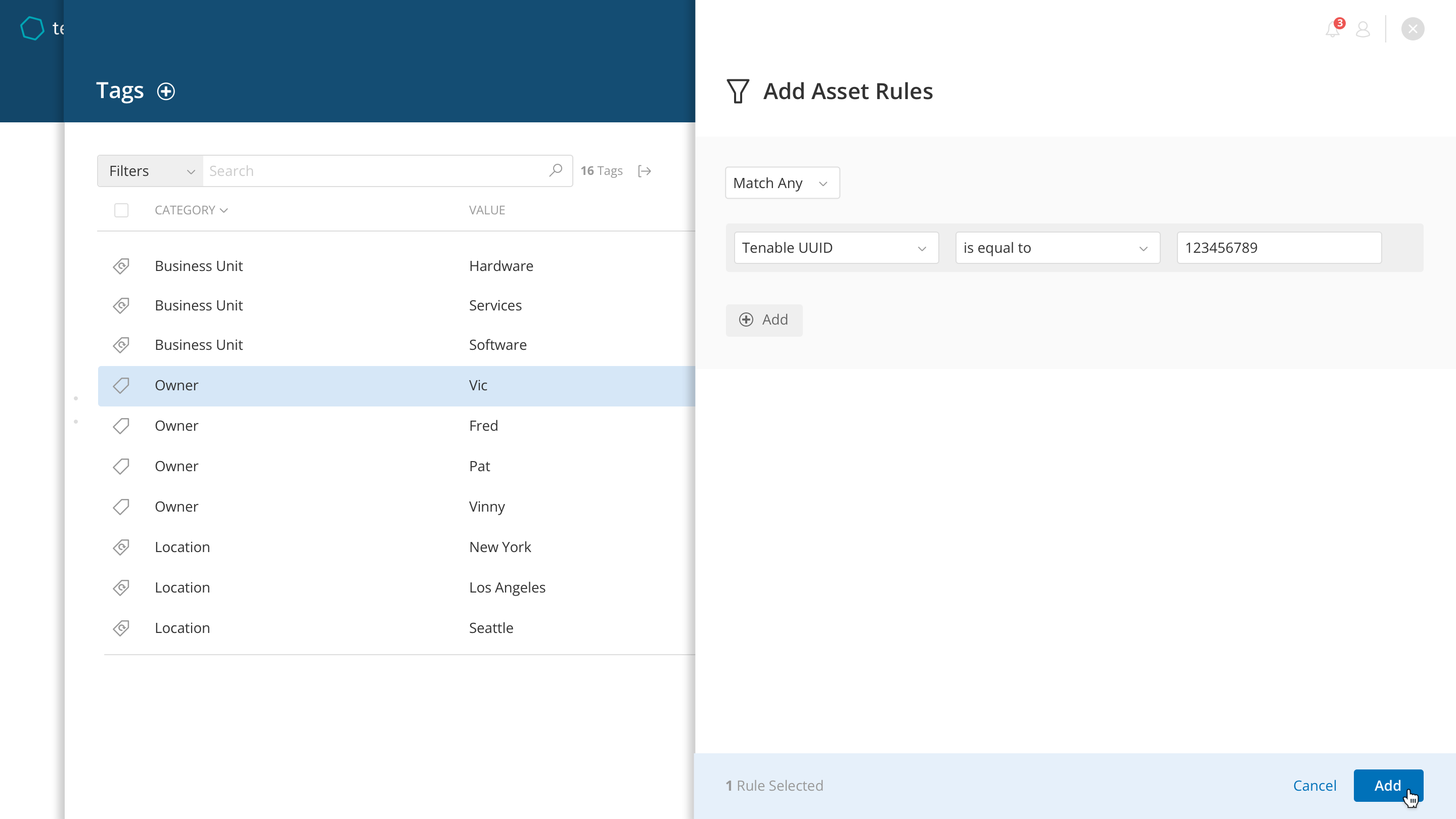
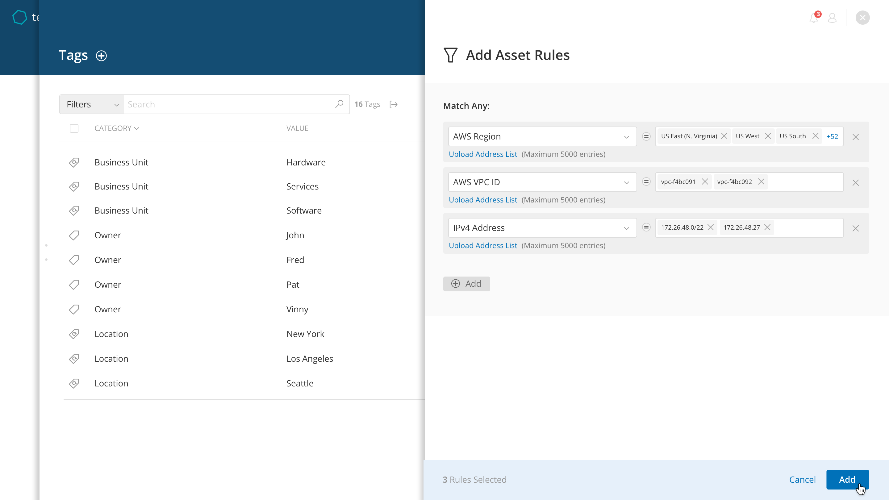
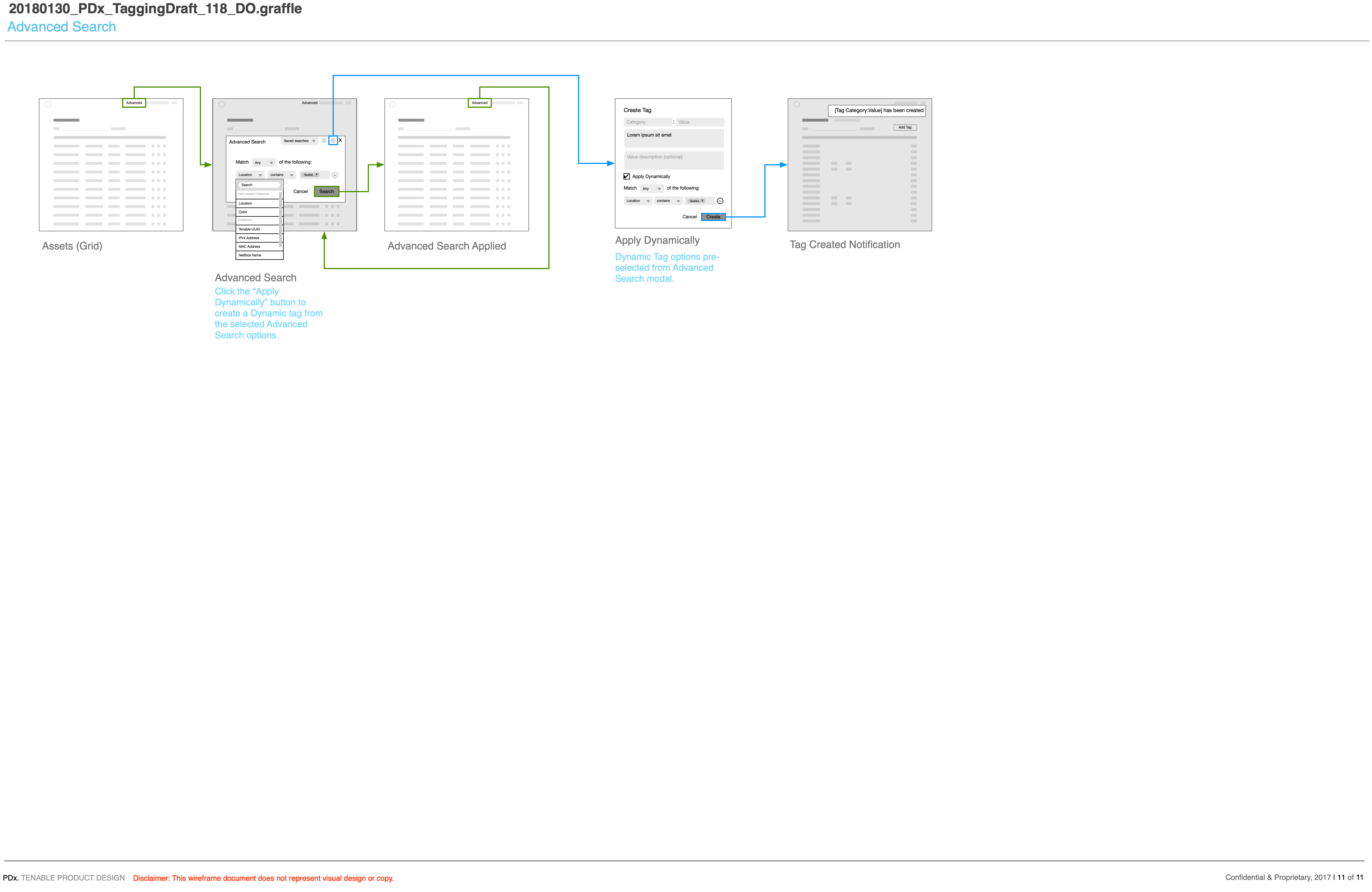
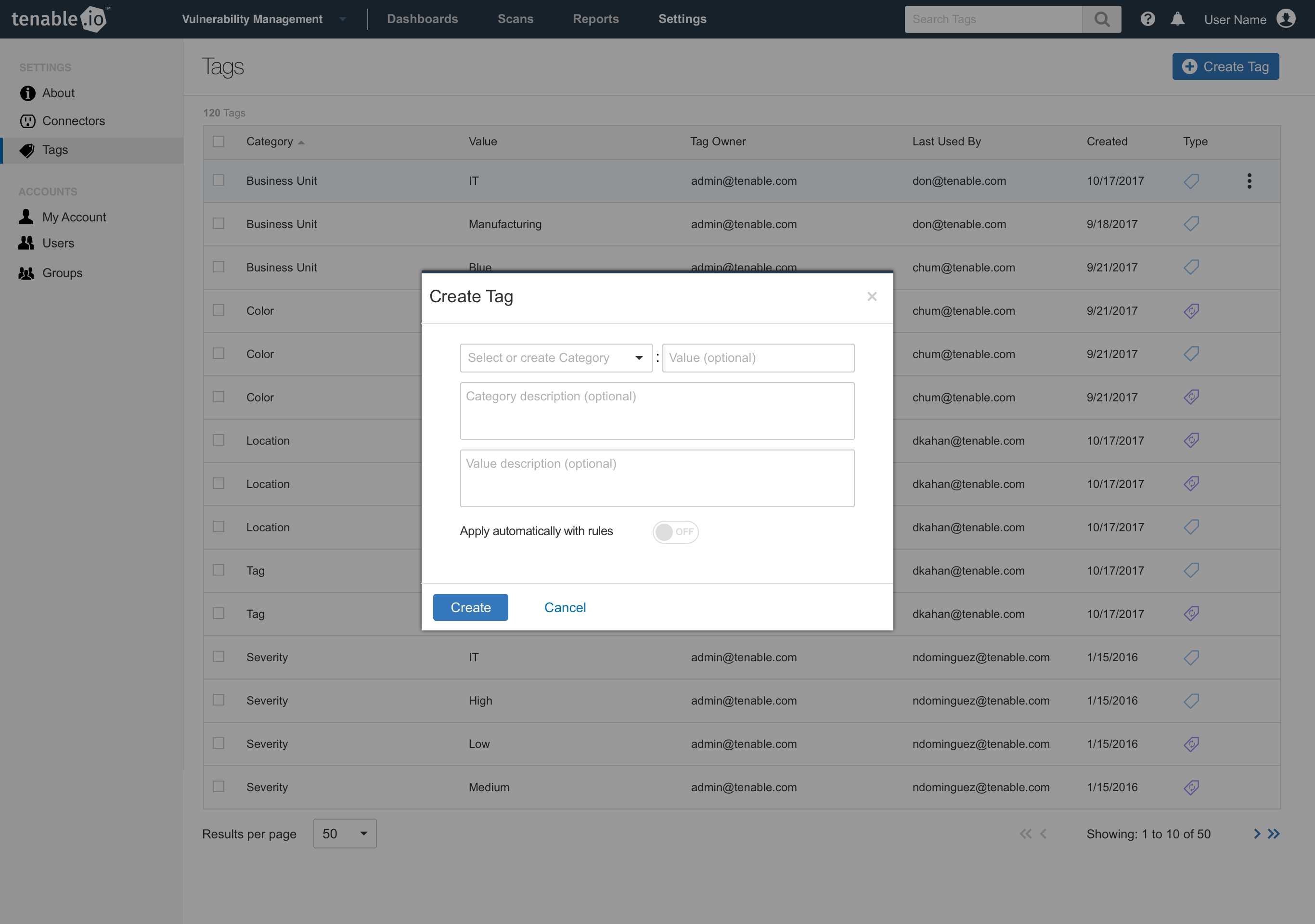
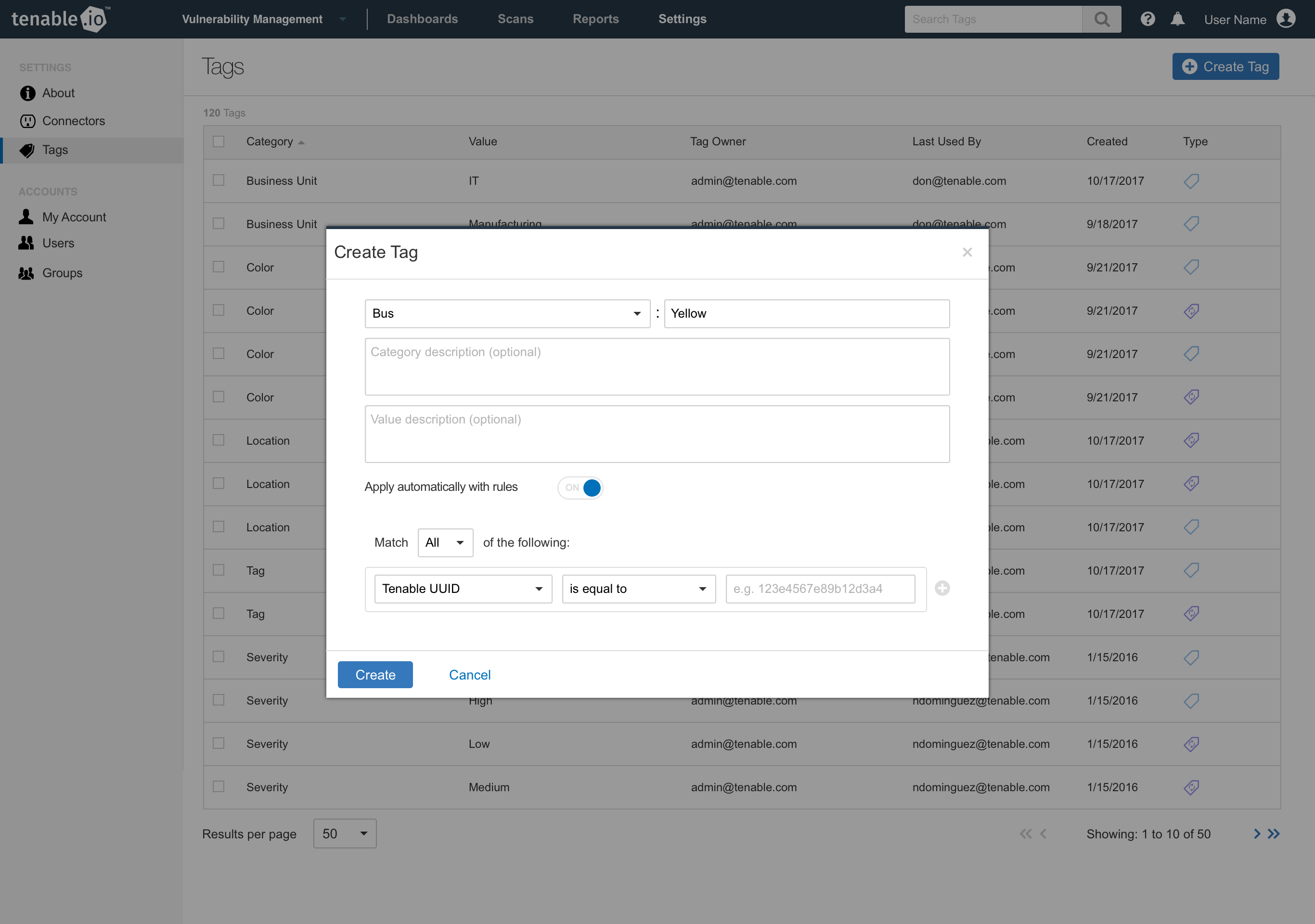
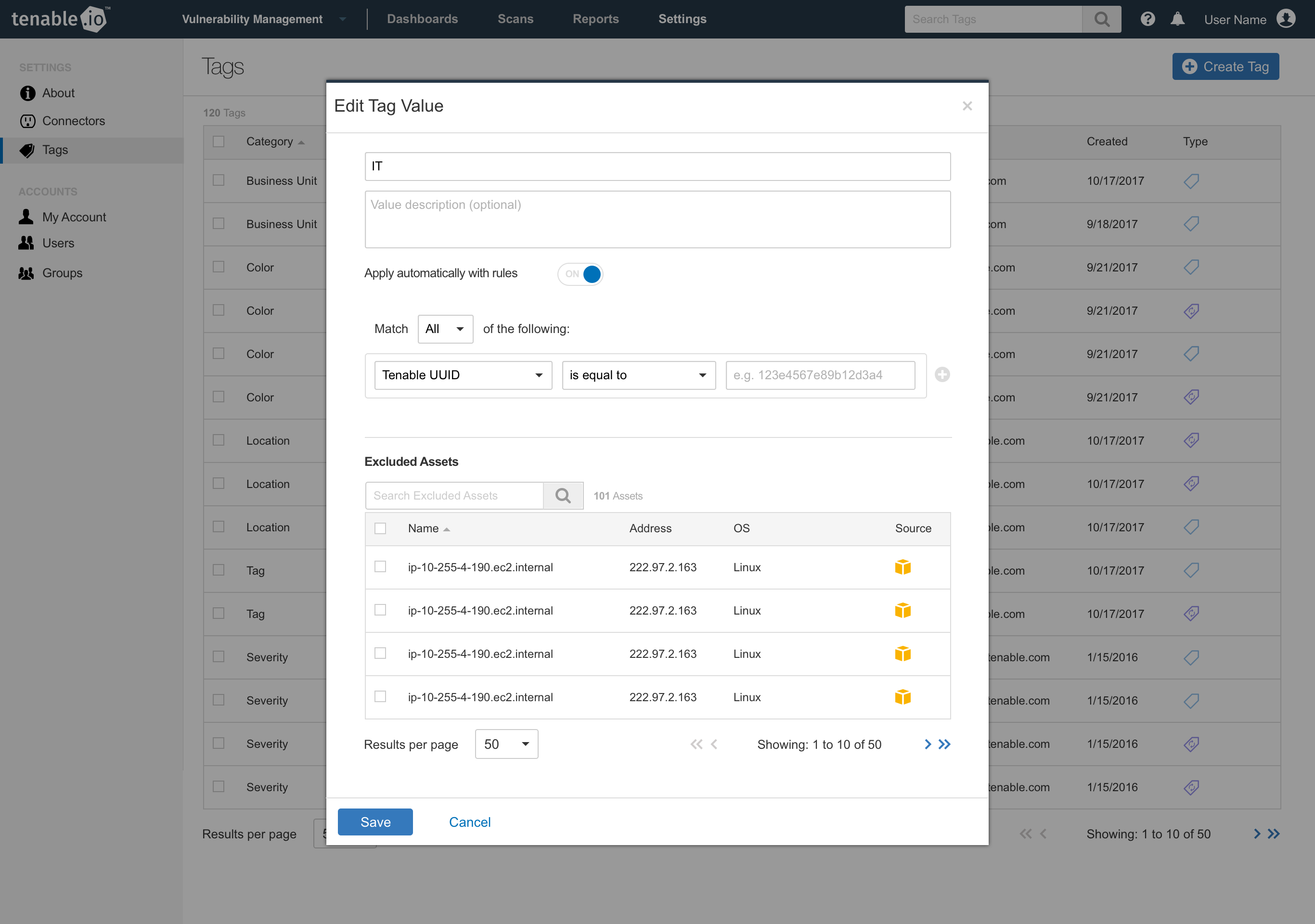
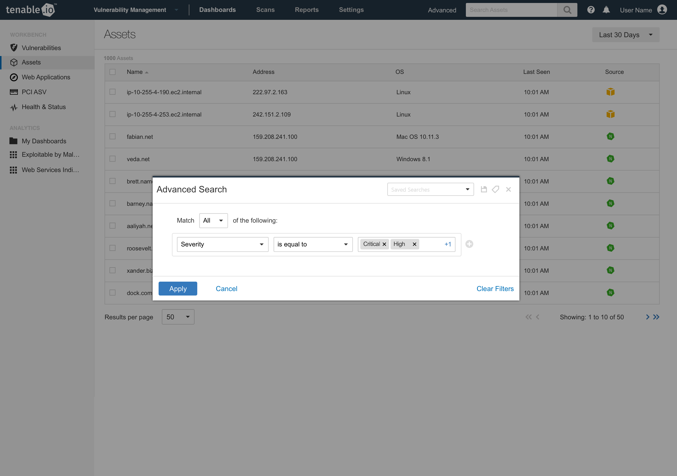
Product and design identified that tagging was one solution to this, through customer feedback and interviews. The goal would be to allow customers to quickly search for machines by tag, see relevant associated machines with that tag, and manage those tags globally across their network. Additionally, we identified the need to tag machines automatically through search filters, reducing the need to manually apply tags. This came from customer feedback, where some customers were adding machines to their network faster than they would be able to keep up with manual tagging. We called this dynamic tagging and tags would be applied automatically when they were discovered by the tagging service.
Solution
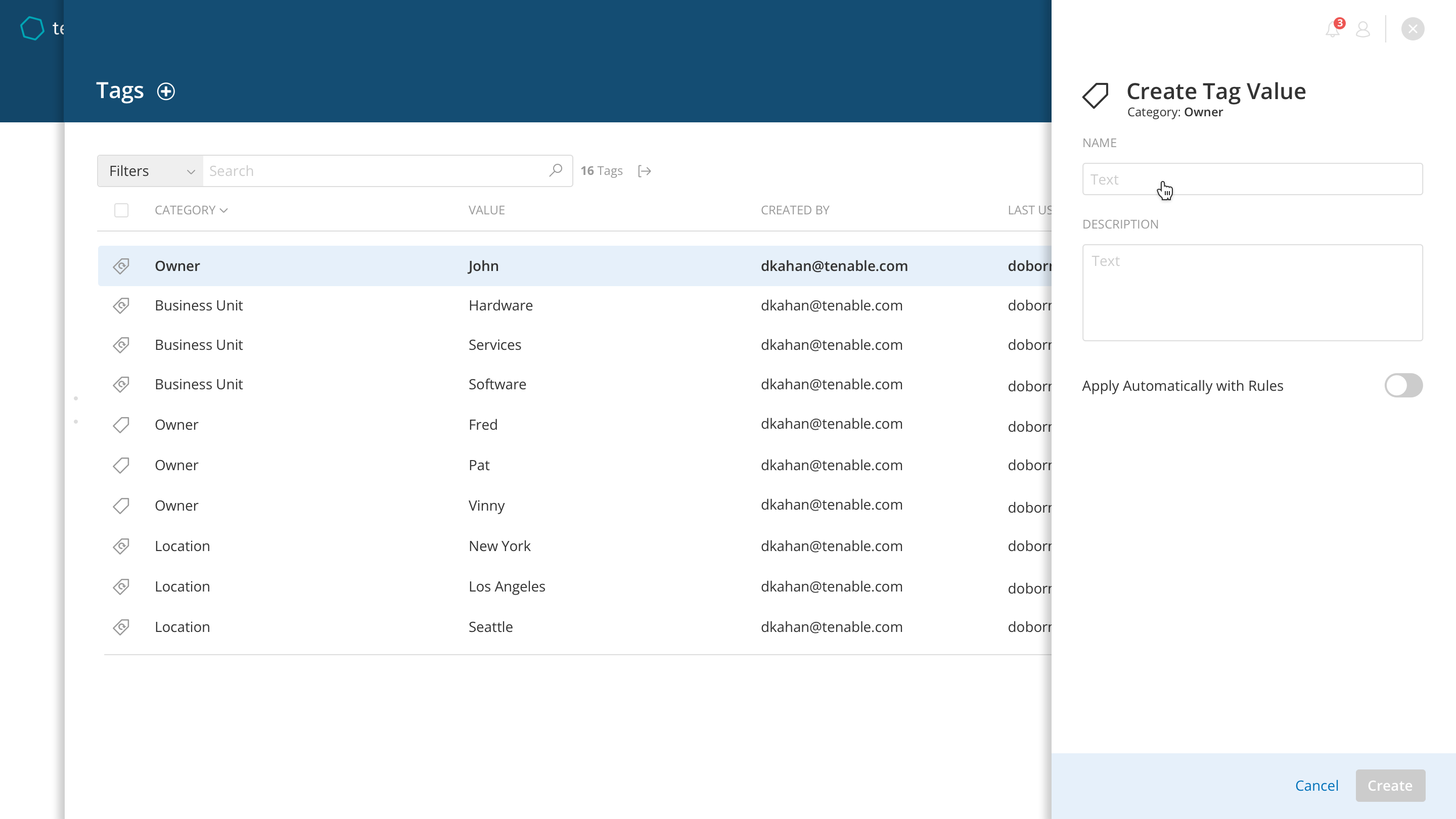
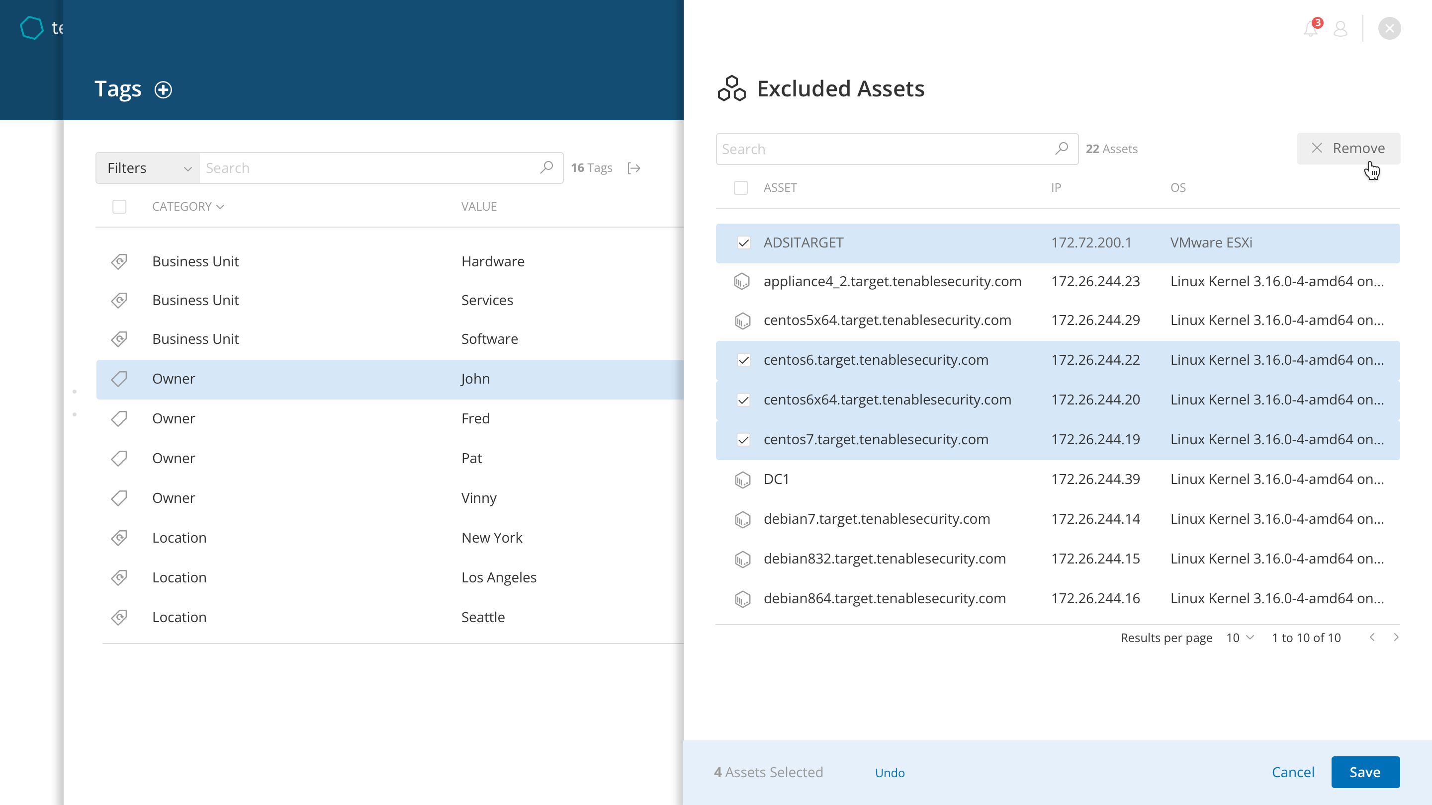
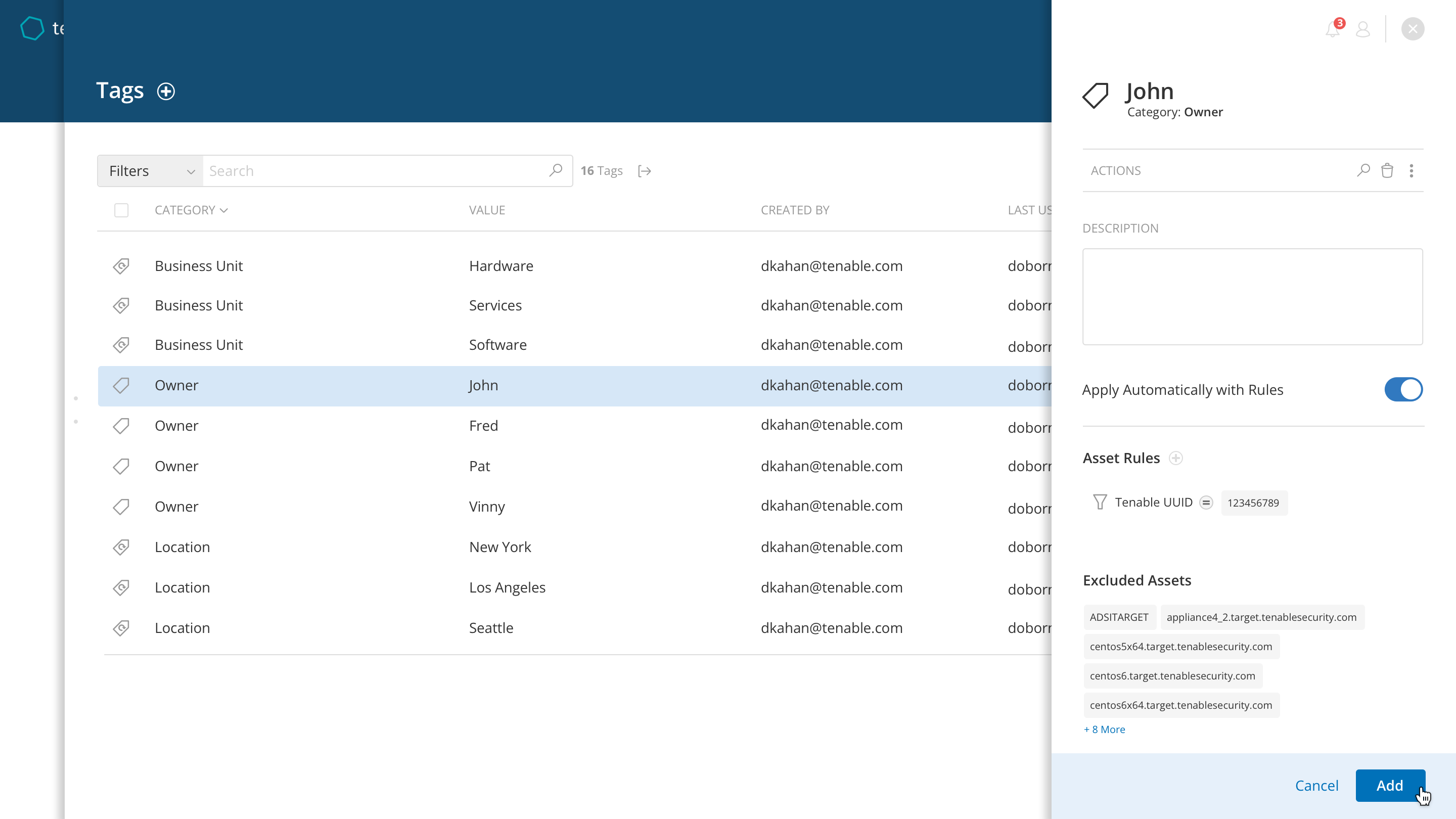
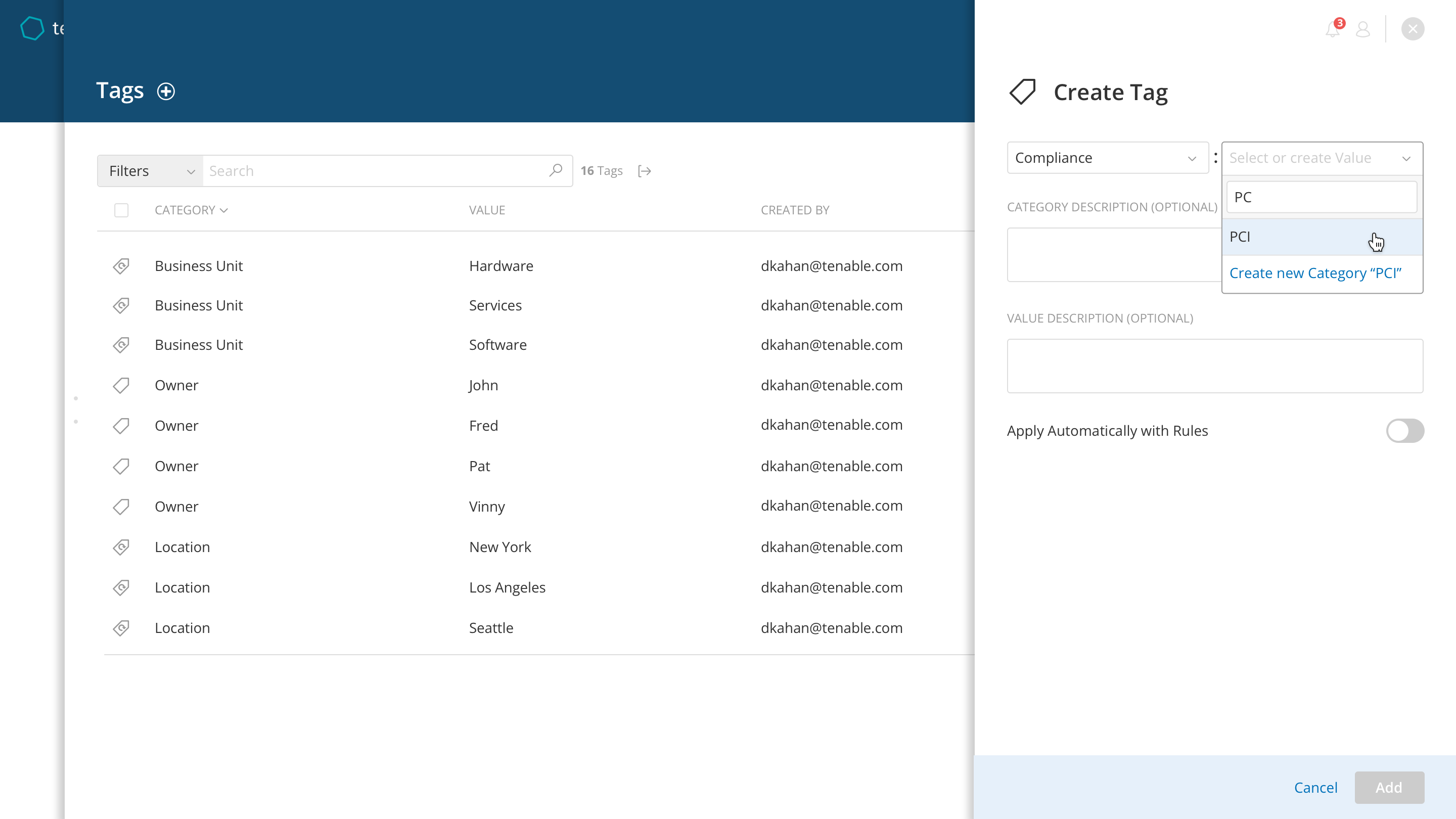
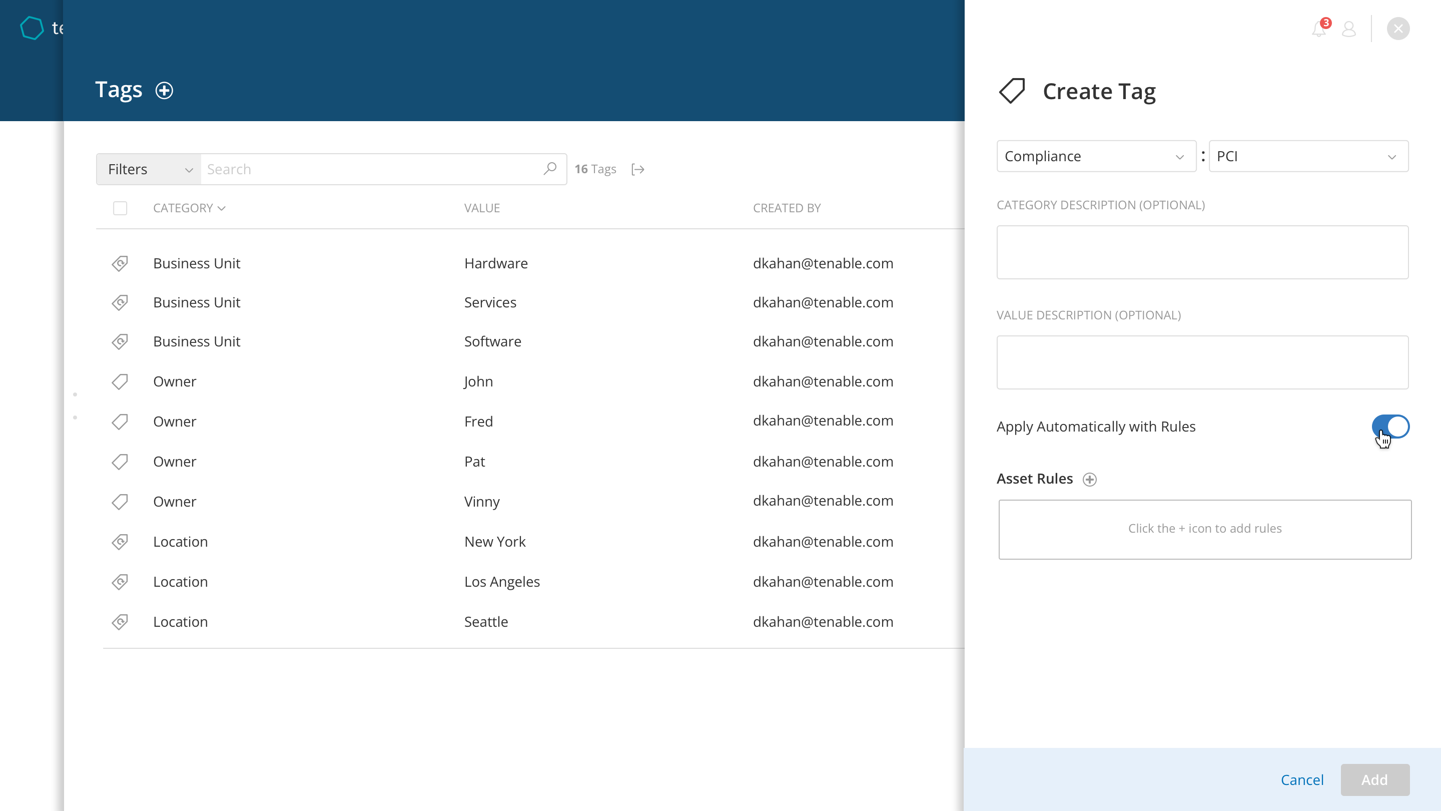
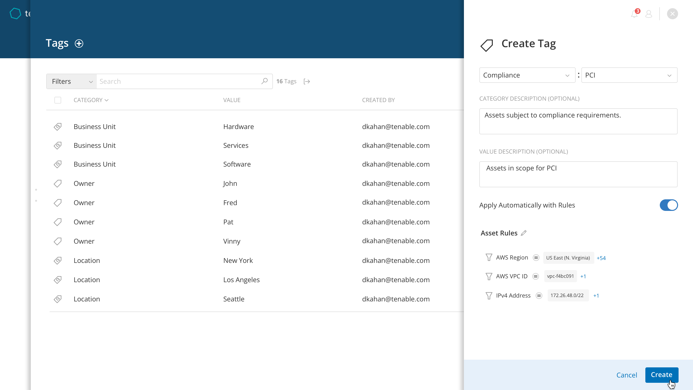
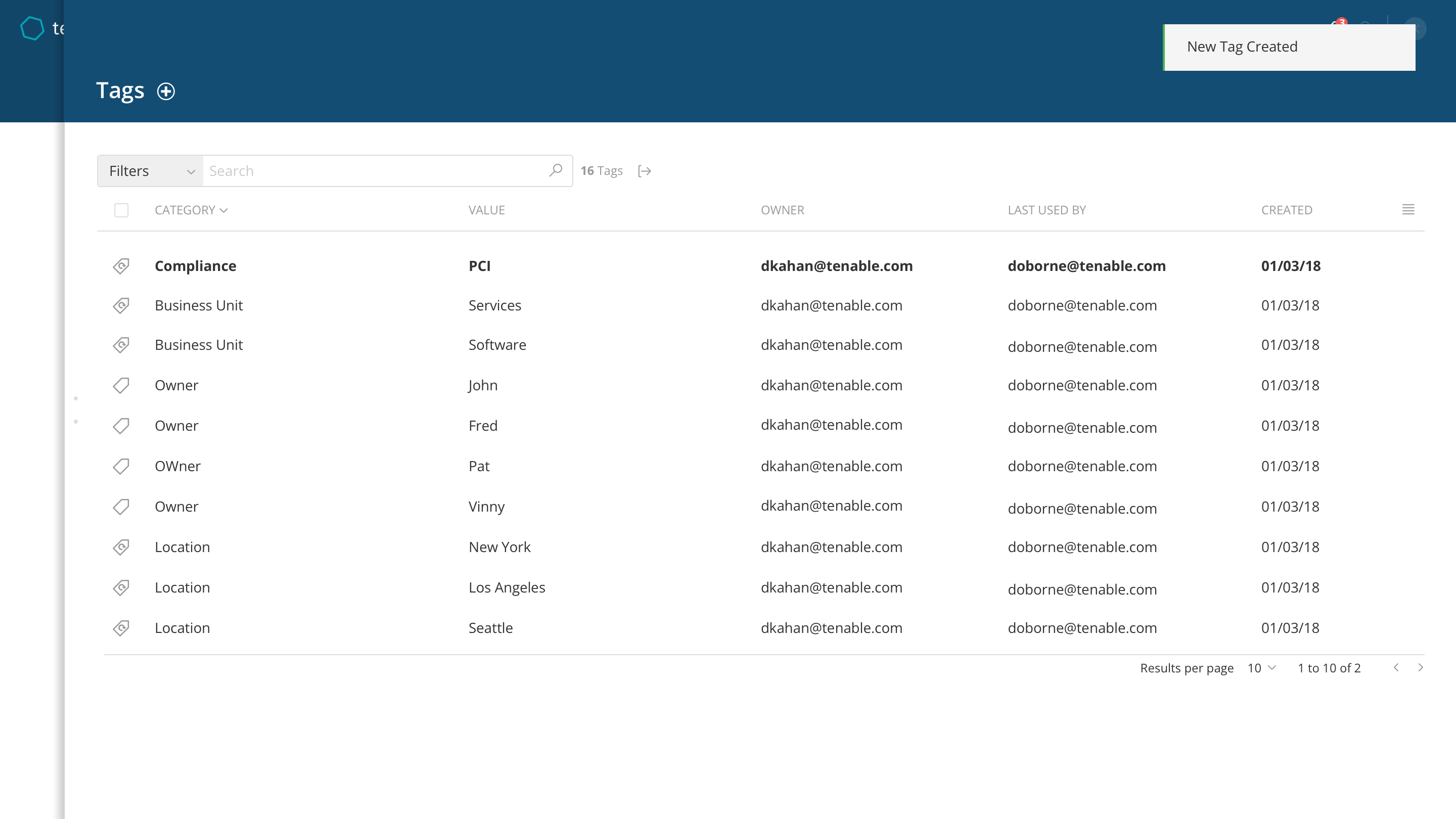
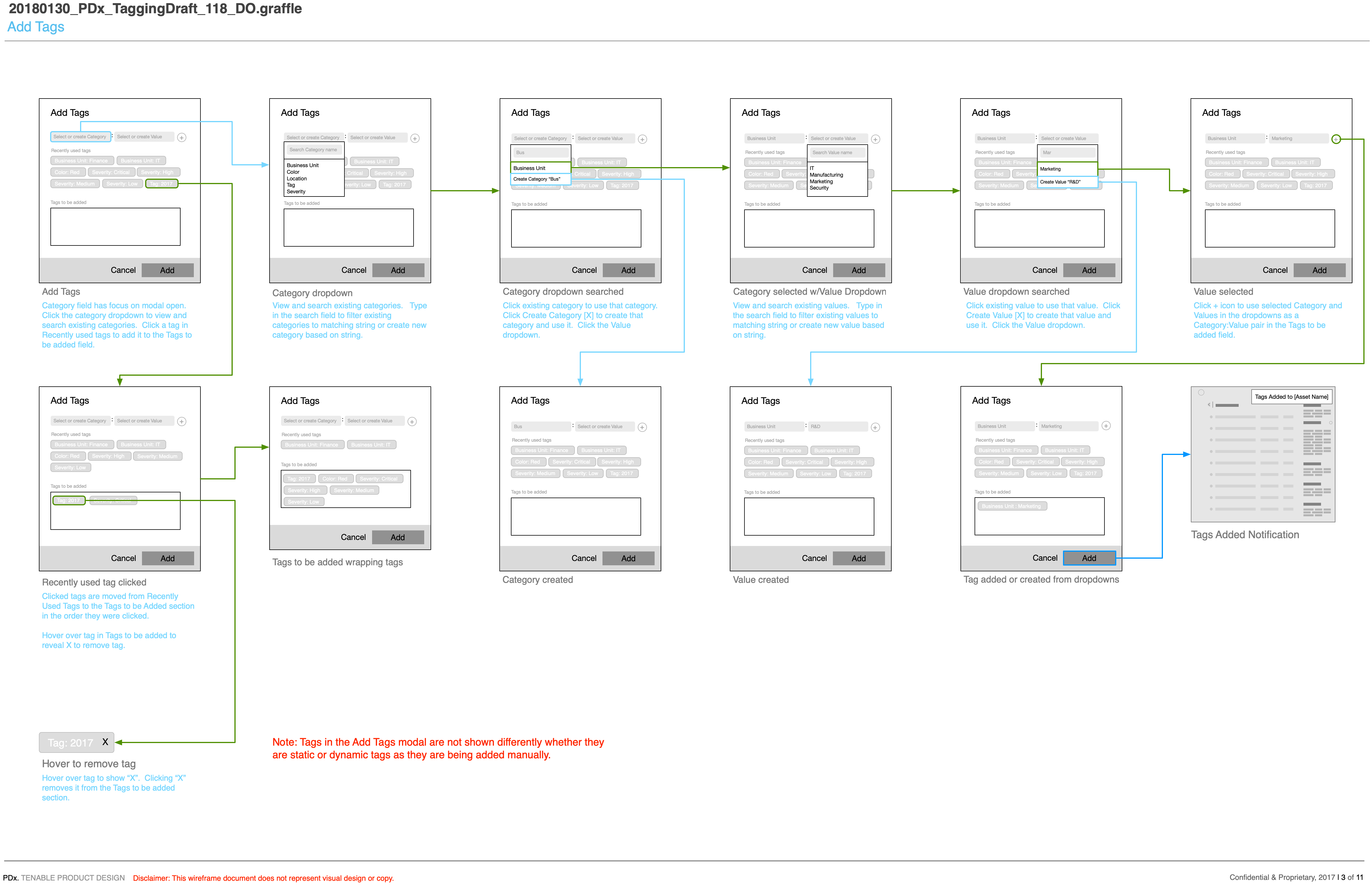
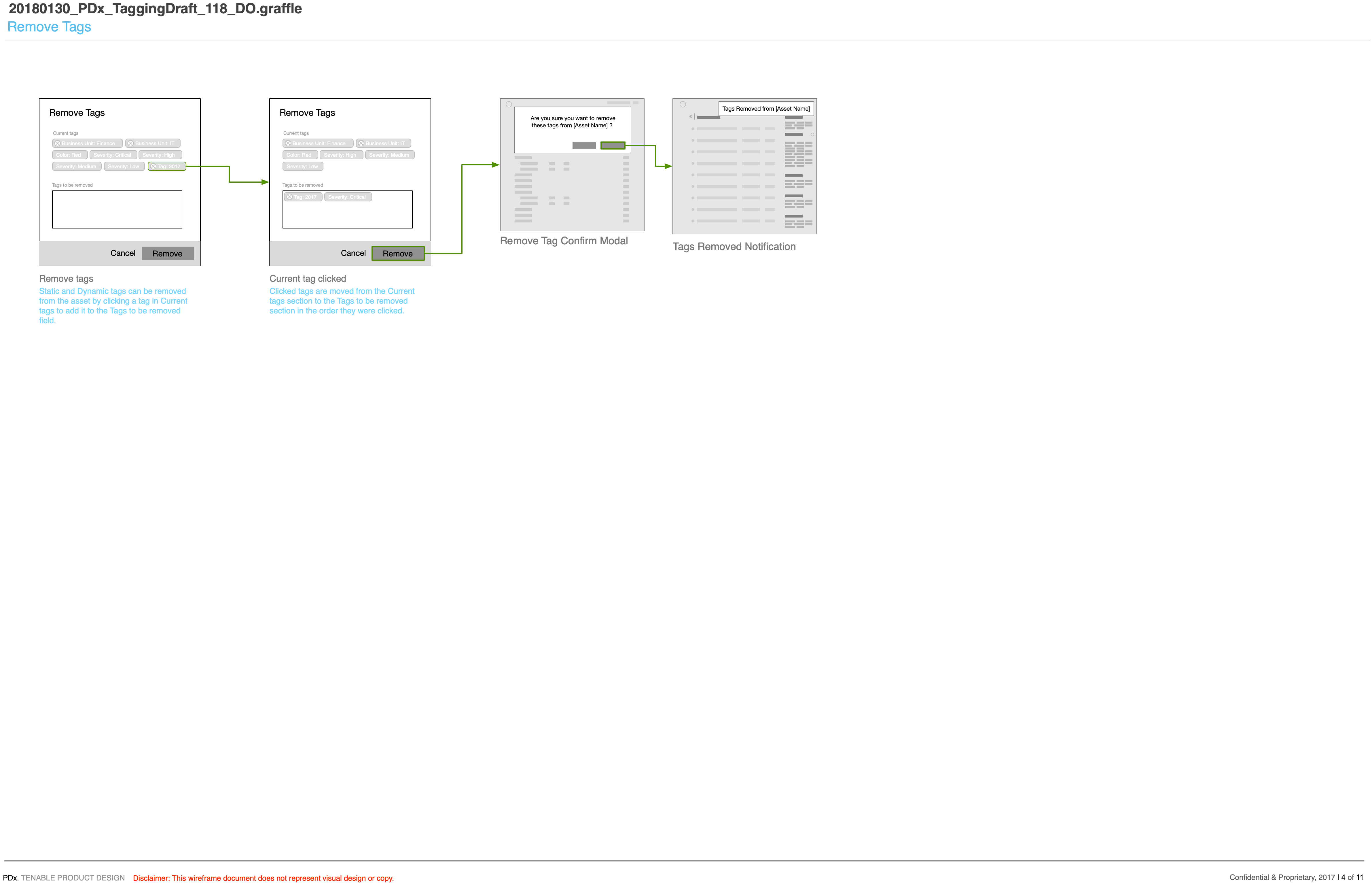
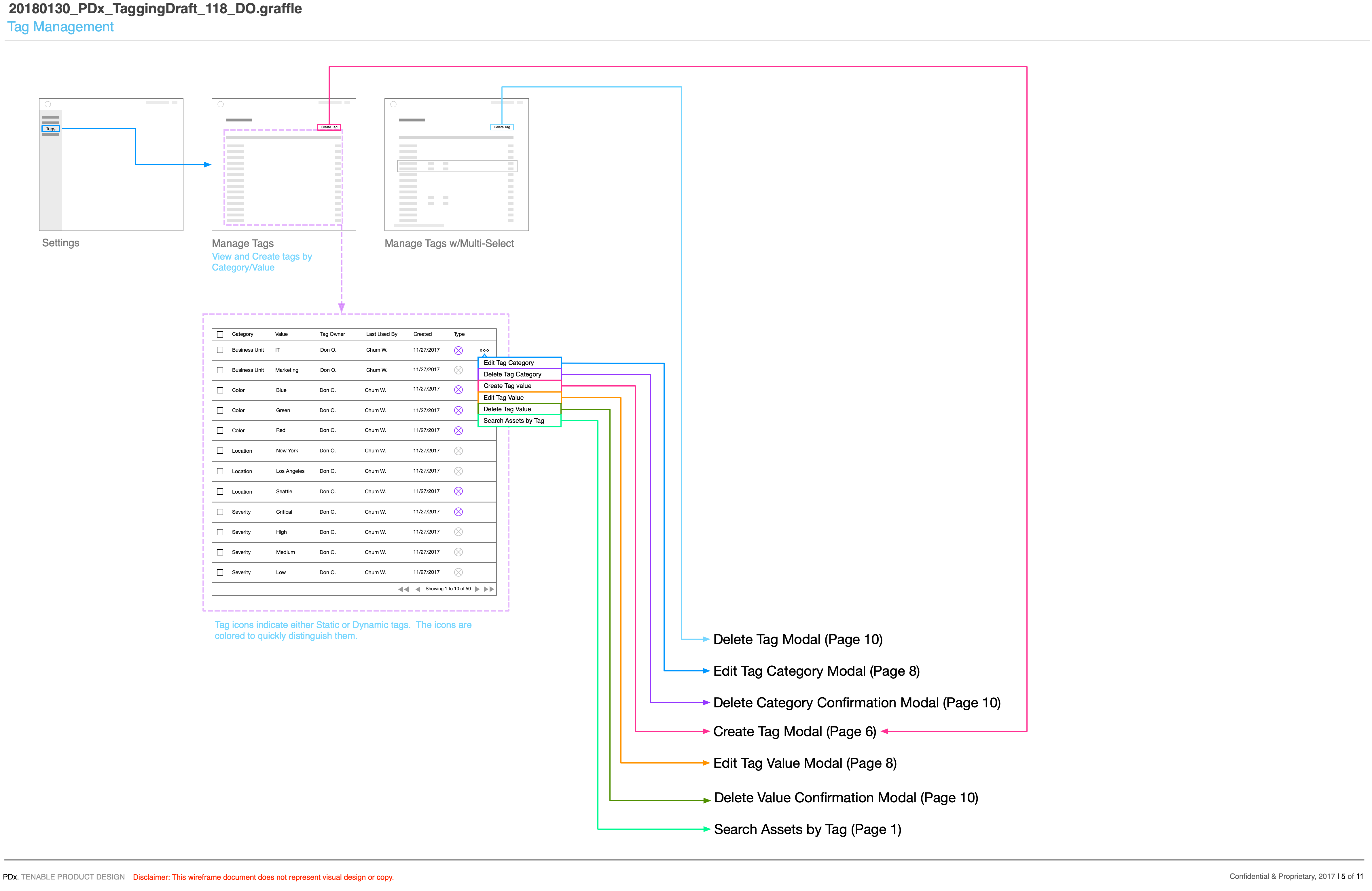
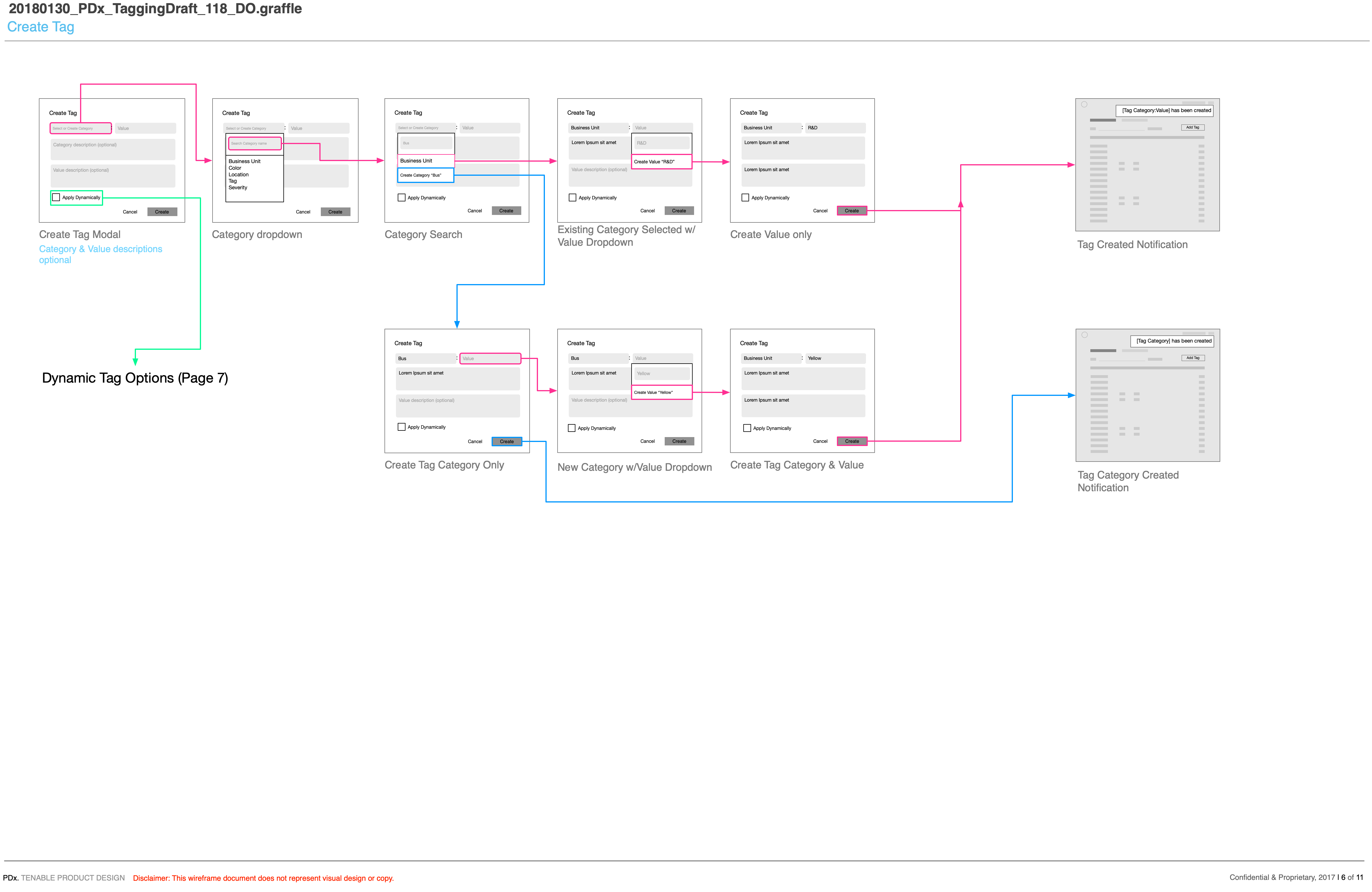
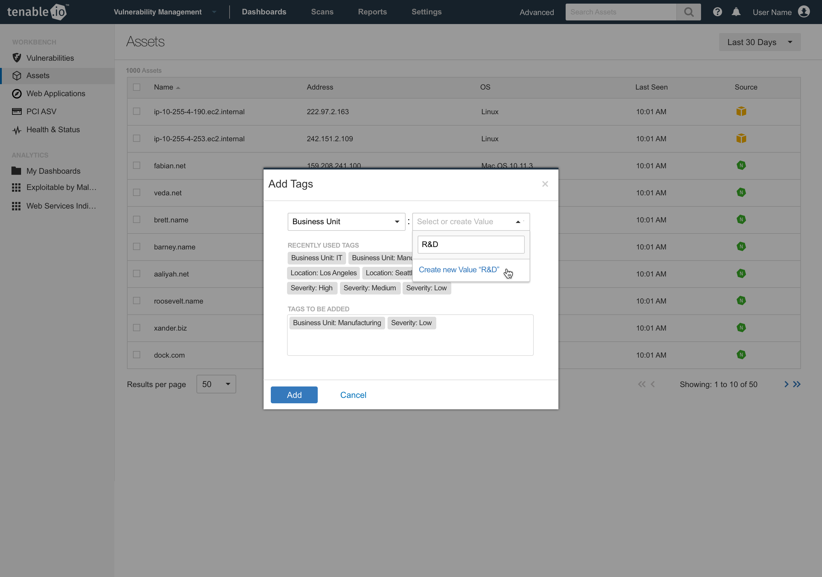
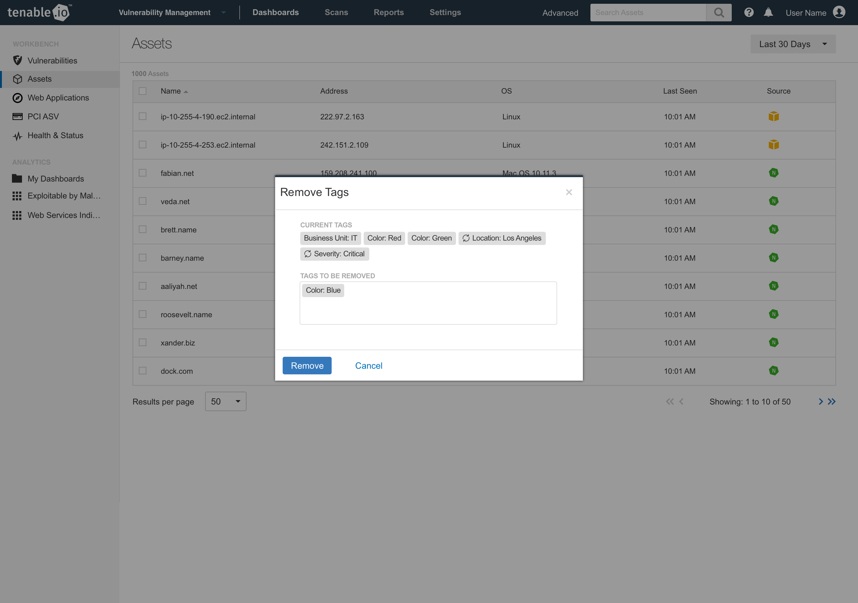
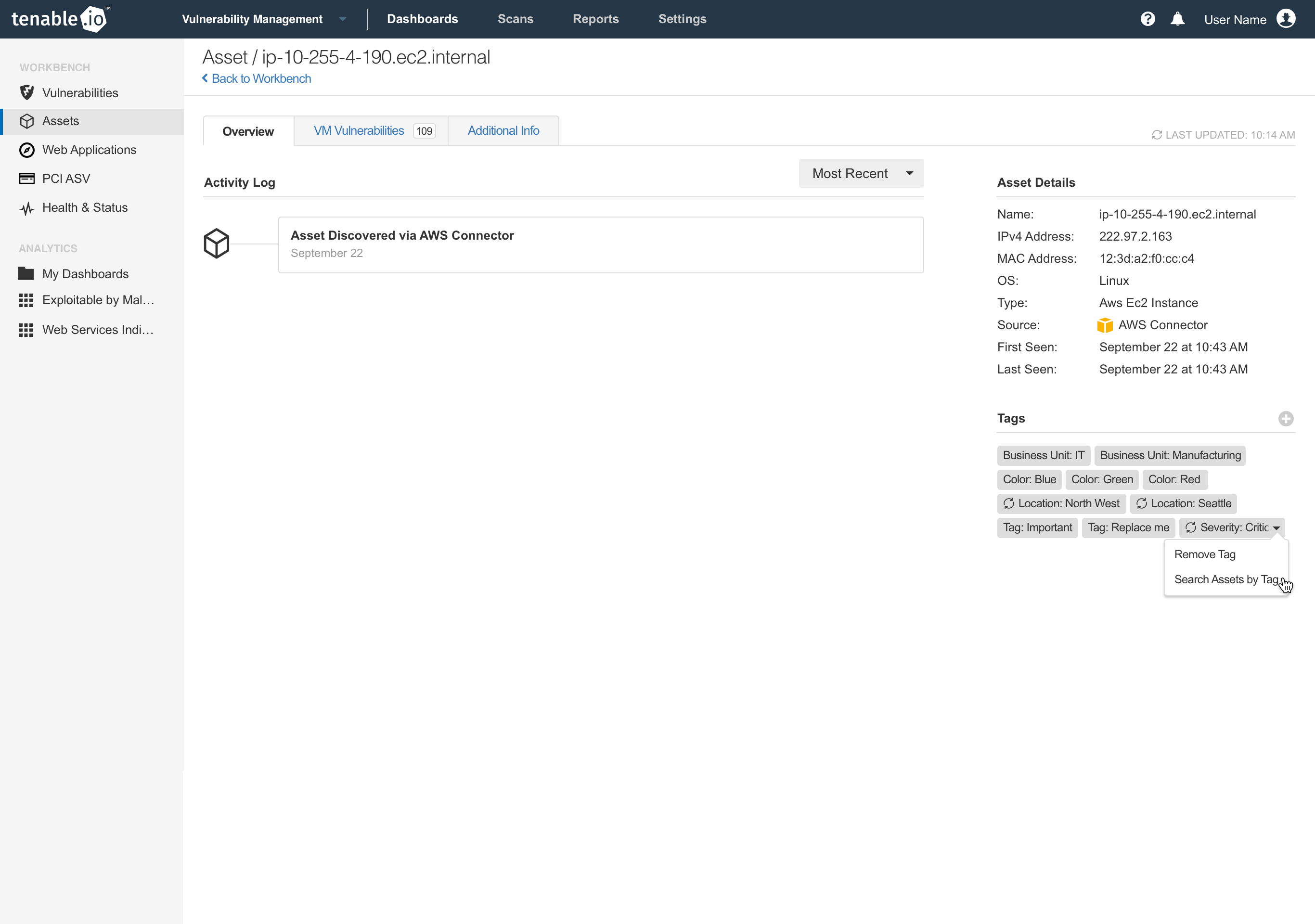
We began by wireframing out the create, apply, edit, remove, delete operations of the tagging system. Tag management would have its own dedicated screen inside of the vulnerability manager product and tags would be visible on every machine in preview and detail screens. Dynamic tags would be an optional feature, but enabled in the same screen as the add and edit screens, switch it on, choose your search criteria and let the system apply the tags for you. We also saw an opportunity to create dynamic tags from the search screen as well. Since the search UI was powering the filtering of machines, let customers run a search, then create dynamic tags out of that search to be applied moving forward.
Redesigning for the next generation
After the initial designs were implemented into the current vulnerability management application, we set out to apply the same UX to our new redesigned application being built using a new design system. The modal style interactions were converted to the full height side panels that overlaid the page content. This allowed us more flexible layouts, more scrolling content and provided better context for the task at hand.